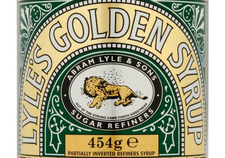
TATE & LYLE this week axed its 140-year-old golden syrup logo after shoppers branded it “grim”.
The image, created in 1881, showed a dead lion being swarmed by bees and was inspired by a Biblical story of Samson killing one of the beasts.
PATate & Lyle this week axed its 140-year-old golden syrup logo after shoppers branded it ‘grim’[/caption]
PAThe new version of the logo features a lion’s head and a single bee[/caption]
The new version features a lion’s head and a single bee.
Mike Ridley looks at the stories of some of the world’s other best-known logos . .
TOBLERONE
Alamyif you look carefully at the Toblerone logo you’ll see the design contains the shape of a bear[/caption]
AlamyThe logo also featues the Matterhorn peak in the Swiss Alps[/caption]
FAMOUS for its triangular shape, the Swiss chocolate features a logo with a mountain theme and the Matterhorn peak in the Swiss Alps.
But if you look carefully, you’ll also see the design contains the shape of a bear, a symbol of the city of Bern, where it was first produced.
Social Media – Refer to SourceFacebook’s logo is just a simple ‘F’ on a blue background[/caption]
AFPMark Zuckerberg is red-green colourblind and blue the easiest colour for him to see[/caption]
NOW just a single letter “F”, the social media giant’s logo is kept simple on a blue background.
This is probably explained by founder Mark Zuckerberg being red-green colourblind and finding blue the easiest colour to see.
MCDONALD’S
The McDonald’s M logo was adopted in 1959
McDonald’sThe first restaurant was opened by Richard and Maurice McDonald in 1937[/caption]
THE burger chain’s first restaurant was opened by Richard and Maurice McDonald in 1937.
In 1952, when the company’s first-ever franchise restaurant opened, the design included two massive golden arches outside to attract customers.
Nine years later, these yellow arches were adopted as the burger joint’s logo.
STARBUCKS
suppliedStarbucks’ original logo was a topless, two-tailed fantasy creature called a melusine[/caption]
StarbucksIn 1987 the designer changed the colour to green and the image to a more modest goddess[/caption]
THE original emblem for the coffee chain, which was founded in 1971, was a topless, two-tailed fantasy creature called a melusine.
But in 1987 the designer changed the colour to green and the image to a more modest goddess.
APPLE
GettyThe reason the Apple logo has a bite was so people would not confuse it with a cherry[/caption]
GettySteve Jobs was on a fruit-only diet when he came up with it[/caption]
IT is a myth that Apple boss Steve Jobs chose an apple with a bite in homage to computer inventor Alan Turing who killed himself with a cyanide-laced apple.
Jobs was on a fruit-only diet when he came up with it.
The reason for the bite was so people would not confuse it with a cherry.
It is also a play on the word “byte”.
ROLLS-ROYCE
AP:Associated PressThe Rolls-Royce logo is allegedly a homage to Lord Montague’s mistress[/caption]
IT is alleged that in 1911, when Lord Montague put a statue of a woman on his Rolls-Royce Silver Ghost as a scandalous memento of an affair with his secretary, other owners copied him.
Following the trend, legend has it that the luxury car firm commissioned a statue of a woman with her arms outstretched and clothes flowing to be put on every Roller.
The Spirit of Ecstasy mascot — still used today — was born.
ROLLING STONES
The Rolling Stones’ ‘Hot Lips’ logo was designed by John PascheHandout
GettyThe Rolling Stones were among the first bands in the world to have a logo[/caption]
THE legendary rockers were among the first bands in the world to have a logo.
Nicknamed “Hot Lips”, the symbol was commissioned in 1970, when the Stones started their own firm to release their music.
New design graduate John Pasche was paid just £50 for his work but the logo launched his career.
CHUPA CHUPS
Chupa Chups colourful daisy- style logo, still used on the sweets to this day, was designed in 1969
GettySurrealist artist Salvador Dali was the man behind the logo[/caption]
WHILE some logos are dreamt up by unknown students or the company’s owner, this one for the Spanish lollipop brand has a famous designer.
The colourful daisy- style logo, still used on the sweets to this day, was designed in 1969 by surrealist artist Salvador Dali better known for his “melting clocks”.
SUBWAY
HandoutSubway’s logo was designed by founder Fred DeLuca[/caption]
UP there with McDonald’s as the world’s largest restaurant chain, Subway was founded in 1965 by 17-year old Fred DeLuca to serve healthy food to athletes.
To save money he drew the logo himself.
The arrows on either end of the word are to symbolise food on the go.
The logo is now on 44,000 outlets in 112 countries.
BASS
suppliedThe Bass brewery was founded in 1777 in Burton-upon-Trent, Staffs[/caption]
suppliedThe logo was the first registered trademark ever issued by the British Government[/caption]
THE Bass brewery was founded in 1777 in Burton-upon-Trent, Staffs.
And the red triangle it used on its ales became, in 1876, the first registered trademark ever issued by the British Government.
FERRARI
AlamyFerrari’s logo is actually a tribute to World War One pilot Francesco Baracca[/caption]
AFPThe car company’s founder Enzo Ferrari[/caption]
THE prancing black horse of Enzo Ferrari’s company was first used on its cars in 1947.
It is actually a tribute to World War One pilot Francesco Baracca, who had a similar horse painted on his plane.
Enzo visited Francesco’s father, who suggested he include it on his car.
COCA-COLA
Coca ColaThe Coca-Cola logo uses a font popular in the 1880s, when the drink was invented[/caption]
IT is perhaps the most famous logo in the world, but the white words on red background was not created by a designer.
It was the company’s bookkeeper, Frank Robinson, who coined the name Coca-Cola and suggested two capital Cs would look good in adverts.
The font he chose was a popular style of the 1880s, when the drink was invented.
NIKE
Carolyn Davidson earned less than £30 in 1971 for designing Nike’s famous swoosh
GettyCarolyn was eventually given shares in the firm which would now be worth more than £1million[/caption]
STUDENT Carolyn Davidson earned less than £30 in 1971 for designing the famous swoosh, which Nike boss Paul Knight did not like at first.
Twelve years later, after Nike’s logo became one of the world’s best-known, Carolyn was given shares in the firm which would now be worth more than £1million.
LACOSTE
Lacoste’s croc logo comes from the nickname of company founder and French tennis great Rene Lacoste
GettyHe got the name after his team captain said he would buy him a crocodile-skin suitcase if he won his next match[/caption]
THE croc logo comes from the nickname of company founder and French tennis great Rene Lacoste.
He got the name after his team captain said he would buy him a crocodile-skin suitcase if he won his next match.
He lost.
Leave a comment